

Brand kit
Making a video about Spotguide?
This page is the whole brief: what to say, which logo goes where, the colors and fonts, the overlays and end cards, and what to film. Read it once and grab the kit.
The whole kit
One zip with every file on this page, plus the logo animation with a transparent background. About 28 MB.
Download the kitQuestions, or need a screen recording of the app? Email us or DM @spotguideapp. press@joinspotguide.com
Say it in one breath
See a restaurant in a Reel? Send it to Spotguide and it’s saved on your map, with what to order. See it, send it, save it.
The longer version
Everyone saves food videos and never finds them again. Spotguide fixes that. DM any Reel, TikTok or post to @spotguideapp, paste a link, or share it from your phone, and the actual restaurant appears as a pin on your personal map. Spotguide watches the video, finds the real place, and remembers why you saved it: the dishes, the vibe, the quote from the creator. When you’re hungry you open your map or just ask Guide, the in-app assistant. Reserve opens the restaurant’s own booking page, already set up for tonight. A “top 5 taco spots” roundup saves all five. For creators, Spotguide credits every save and booking their videos drive, and pays them for it. For restaurants, it’s proof that creator content fills tables.
Names, handles, links
Exactly as written. The logo’s lowercase wordmark is the only exception.
- Brand name
- Spotguide — one word, capital S only. Never “SpotGuide”, “Spot Guide” or “SPOTGUIDE”.
- @spotguideapp
- Website
- joinspotguide.com
- For creators
- joinspotguide.com/creators
- For restaurants
- joinspotguide.com/partner/apply
- Where to get it
- Free on the App Store and Google Play
- The assistant
- Guide (the in-app chat). The tabs are Map, Spots, Add, Chat and Settings — use those names exactly.
The slogan
See it. Send it. Save it.
- Always in one color: all white on dark, all ink on light. Never color one word differently.
- On big, fast surfaces (end cards, title cards) use capitals as above. In a caption or a spoken line, “See it, send it, save it” is fine.
- It’s the headline for brand-level moments. It is not a hashtag.
The logo
The gradient pin and the lowercase wordmark. Use the files as they are.

Logo on dark
The default. Gradient pin, white “spot”, gradient “guide”. For dark footage and the end card.

Logo, all white
Over busy footage or photos, when the gradient would fight the picture.

Logo on light
Light or white backgrounds. “spot” is gray here.

Pin, gradient
The pin alone. Corner bugs, profile pictures, tiny spaces.

Pin, white
The pin alone in white. Watermarks.

App icon
The App Store icon, when you show “the app” as an icon.
Rules
- The gradient logo sits on near-black (#05080F), not on navy and not on a blue glow. On darker colors the blue half of the mark disappears. If you can’t put it on near-black, use the all-white logo.
- Don’t stretch, rotate, outline, recolor or add drop shadows. Don’t put the gradient logo on top of a flat blue.
- Clear space: at least the width of the pin’s stroke on every side.
- Minimum on-screen size: the pin at 48 px tall, the full logo at 240 px wide on a 1080p frame. Smaller than that, use the pin.
- On footage, put the logo on a scrim or a glass pill so it’s readable. Never straight onto a bright, busy frame.
- One logo per frame. Not the logo and the pin.
Colors
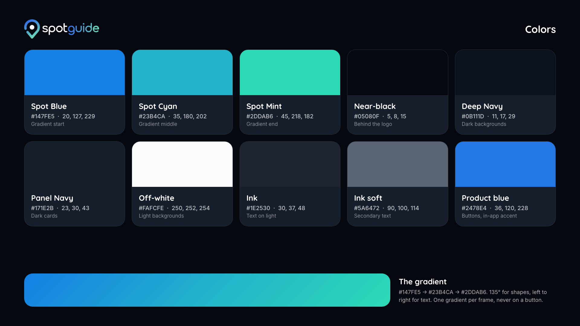
Hex for design tools, RGB for video editors. Tap a swatch to copy the hex.
The gradient
Blue #147FE5 to cyan #23B4CA to mint #2DDAB6, at 135 degrees for shapes and left-to-right for text.
- Roughly 70% neutral (near-black, navy, off-white, white text) and 30% blue and mint. The gradient is the garnish, not the base.
- Gradient text is a signature move: one keyword in the gradient, the rest of the line in white. Only at headline sizes. Never gradient text on a gradient background.
- Buttons and pills are flat product blue with white text, never a gradient.
- The backgrounds further down already follow these rules. Put your text on them and you’re on-brand.
Type
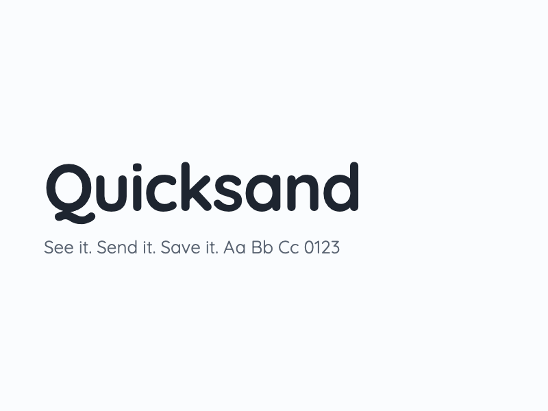
Two fonts, both free. They’re in the downloads below.
Headlines, big numbers
Quicksand
Bold (700)
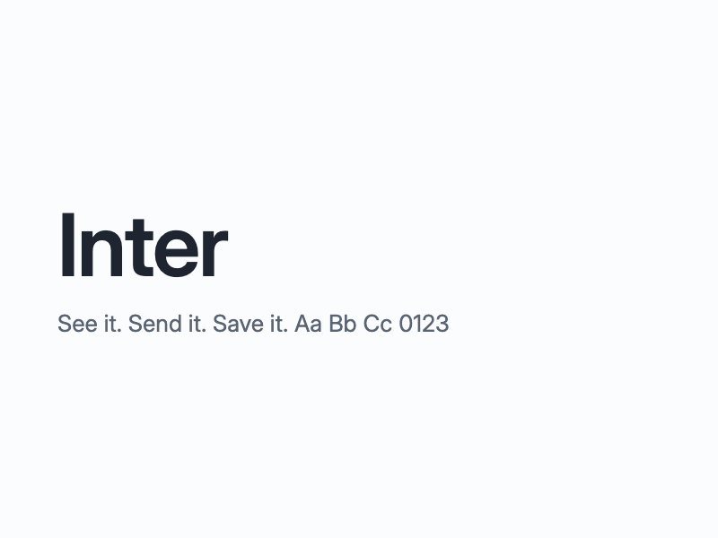
Body, captions, labels
Inter
Regular 400, Medium 500, Semibold 600
If you can’t install fonts
The phone’s own font (SF Pro on iPhone)
Use it for everything rather than mixing in a random font
- Sentence case everywhere. “Send the post. Get the pin.” Not “Send The Post” and not “SEND THE POST”. Tiny overline labels are the only place capitals are allowed.
- Headlines tight and heavy, body relaxed. Line height around 1.05 for headlines, 1.4 for body.
- No emojis anywhere, on screen or in captions. Use a simple line icon instead if you need a symbol.
On-screen text and overlays
Transparent PNGs rendered at 2x (4K-ready). Scale them down to taste; never up.

Handle pill, dark
The first time Spotguide is mentioned, and any time you say “DM it to”.

Handle pill, light
The same pill for bright footage.

Website pill, dark
When you say where to get it.

Website pill, light
The same pill for bright footage.

Call-to-action pill
Over the last few seconds, or under a demo moment.
Lower third
Bottom-left, under 4 seconds, once per video.

Watermark
The white pin at 60%. A corner bug for the whole video, if the platform doesn’t add its own.
Safe zones
Safe zones for vertical video (1080 x 1920): keep text out of the top 250 px and the bottom 320 px, and 60 px in from each side. Reels and TikTok draw their own buttons and captions there. The end cards and backgrounds already respect this.
Captions
Burn in short captions in Inter, sentence case, white with a soft dark shadow or on a glass pill. Also send the SRT file so we can reuse them.
What to show
The product is the hero. The cleanest demo, in order:
Other things that film well: the Add tab taking a pasted TikTok link, a “top 5” roundup saving every spot at once, walking past a saved place and getting the nudge, the share sheet card saving without leaving Instagram. Ask us for screen recordings of any of these. Use real screens, never mockups you drew.
- 1
Someone watching a food Reel on Instagram.
- 2
Tapping share and sending it to @spotguideapp, exactly like sending it to a friend.
- 3
The reply: “Got it! Finding the restaurant…” then “Saved” with the restaurant’s name.
- 4
Opening Spotguide: the pin on the map, the spot page with the photo, the quote from the video, and what to order.
- 5
Asking Guide something human: “where was that pasta flight place?” or “date night near me, open now”.
- 6
Tapping Reserve and landing on the restaurant’s own booking page.
Tone and look
- Warm, candid, real. Phone-shot energy, natural light, real food in real restaurants. No stock footage, no studio gloss.
- Talk to one person. “Your map”, “your spots”. Say “send us the post, get the pin”, never “leverage AI-powered discovery”.
- Plain English. No corporate words, no hype words. Numbers and specifics beat adjectives: “a 19-photo guide saved six spots” is the brand’s kind of line.
- Music: upbeat, light, not trendy-loud. Licensed for the platform you post on.
- Dark mode is the brand’s home look, but the app’s light theme is just as real. Show whichever the scene calls for.
Say this, not that
Everything on the left is true today. Everything on the right gets a video sent back.
Free on the App Store and Google Play
“Download now before it’s gone”, countdowns, fake urgency
Send any Reel, TikTok or post and the restaurant lands on your map
“Works with every app on earth”
Spotguide watches the video and finds the real place
“100% accurate”, “never wrong”
Creators earn when their videos drive saves and bookings
Any dollar amount, rate, or “earn $X a month”
Restaurants see which creators send them guests
Numbers of restaurants, users or downloads unless we give you one
Ask Guide anything about your spots
“ChatGPT for food” or naming other AI products
- Don’t show real users’ names, maps or saves. Use your own account or one we set up for you.
- Don’t use another company’s logo as part of ours, and follow Instagram’s and TikTok’s own rules for their icons and names.
- Get the restaurant’s okay before you film inside, and don’t show staff or diners who haven’t agreed.
- If Spotguide is paying you for the video, say so the way the platform requires (the paid-partnership label, or “#ad” at the start of the caption).
Delivering files
First drafts are welcome before anything is polished. It’s easier to steer early.
- Vertical (Reels, TikTok, Shorts)
- 1080 x 1920, or 2160 x 3840 if you shot in 4K
- Horizontal (website, YouTube)
- 1920 x 1080, or 3840 x 2160
- Frame rate
- Whatever you shot at (24, 30 or 60), kept constant
- Format
- H.264 or H.265 MP4, highest quality your editor offers (around 20 Mbps or more at 1080p)
- Audio
- Stereo AAC, loudness around -14 LUFS, no clipping
- Ending
- End with an end card for the last 3 seconds, or the logo reveal over your last shot
- Also send
- The SRT captions, a clean version without burned-in captions, and the thumbnail frame
- File names
- spotguide-<topic>-<9x16 or 16x9>-v1.mp4, for example spotguide-dm-demo-9x16-v2.mp4
Send finished files back to whoever sent you this page.
End cards, backgrounds, fonts
Everything else in the kit, one file at a time. The zip at the top has all of it.
End cards
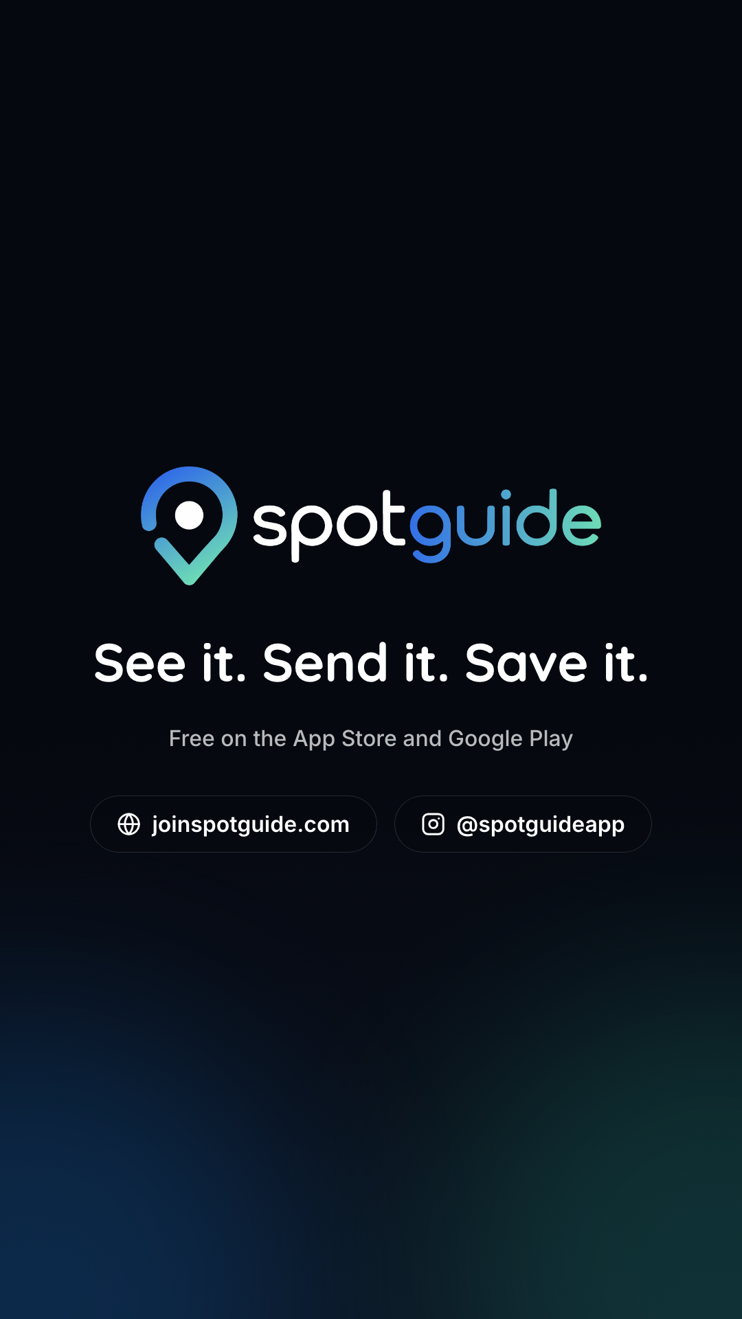
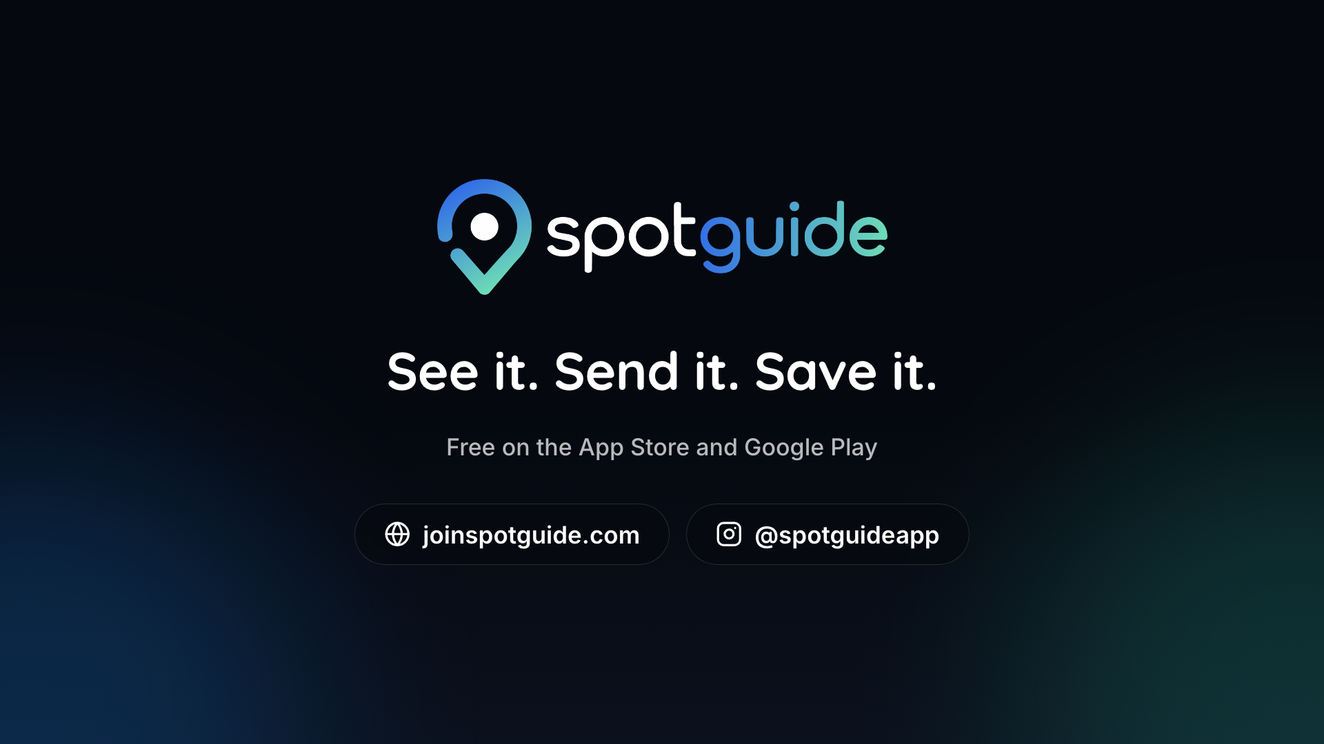
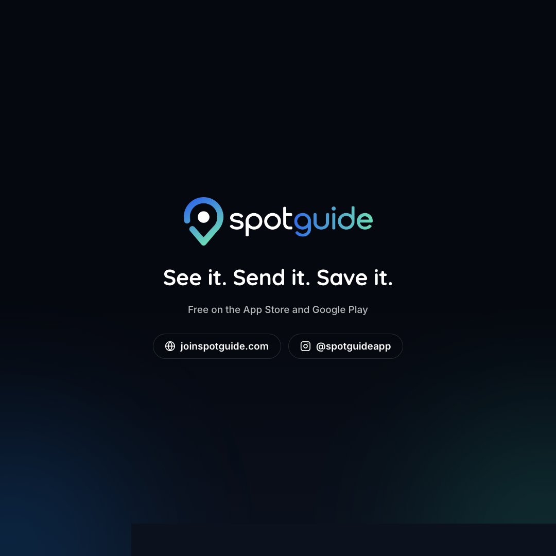
The last three seconds of every video. PNG stills, or the MP4s that fade in.
Logo animation
The logo fading in on a transparent background (ProRes 4444 with alpha), 9:16 and 16:9. They’re in the zip, in the 04-logo-animation folder, with a note on using them.
Backgrounds
Put your text on these. Near-black with the brand glow, or the full gradient. 4K.




Colors and fonts
The palette as a card and as text, and both fonts (Open Font License).
Never lose a restaurant again.
Send your first Reel tonight. Your food map starts in seconds.
Free on iPhone and Android. Or open it in your browser